Don Mann’s Brand Evolution
We firmly believe that good design and effective marketing are, at their heart, about stories: solving a problem, meeting a challenge, inventing a new way of doing things. In this series, we’re looking back at some memorable projects for great clients and, in doing so, telling our own story.
In this piece, we revisit our experience working with Don Mann Excavating, providing this established Vancouver Island business with a refreshed brand and new web presence in 2018.
A Longstanding Brand
In 1947, Don Mann founded a small company with nothing more than his steely work ethic and a single tractor. Over seventy years later, Don Mann Excavating carries on his legacy, successfully serving commercial and residential clients across Vancouver Island.
With the third generation taking ownership, the company was due for a brand evolution, one that would recognize its status as a key industry player while paying tribute to its roots as a homegrown family business.
A Fresh Look
We were excited to get started but knew there might be some growing pains. As Chief Operating Officer Jordan Mann put it, when it came to updating the logo, “there was some trepidation over honouring Grandpa.” After all, the logo depicted their grandfather and had been with the family since the earliest days.
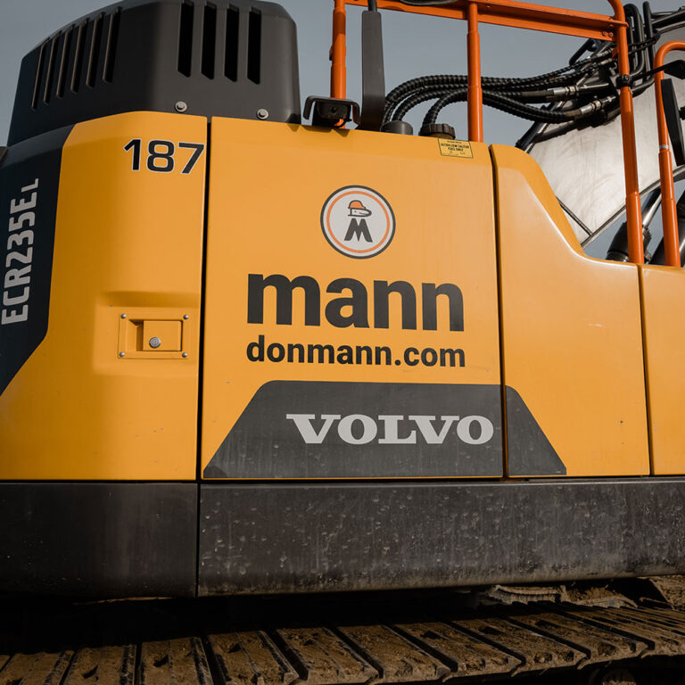
Fortunately, no one needed to worry for long. Leap cleaned up and standardized the logo, retaining the smiling face wearing a hardhat above the letter M. Next to this image, we stripped down the words “Don Mann Excavating” until we had only one word: Mann. Simple, confident, and, most importantly, inclusive, recognizing multiple generations of owners and staff.
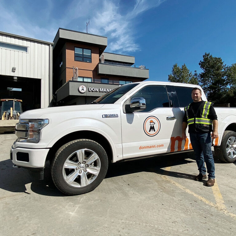
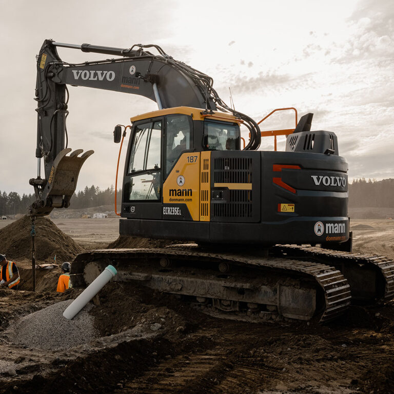
It’s also easily recognizable from a distance on trucks, equipment, and site signage. With its lower-case letters and bright orange colour, it’s bold and modern, yet still approachable, translating as well on mobile as on physical applications. Before, Jordan says, there had been some confusion over the logo as they had a few versions, and it was hard to make out the figure in the image. Afterwards, the Don Mann name was much more visible. “It’s rare for us to direct advertising,” Jordan explains, preferring to support community sponsorships. As a result, their trucks and signs need to do a lot of work for them. The feedback’s been positive: people mention seeing the Don Mann trucks in their neighbourhoods, the brand’s identity visible at a glance.
A Major Industry Player
Leap completed the brand refresh with a website that communicates both the family story and the company’s record of achievement. The difference has been appreciable. As Jordan says, the brand refresh positioned Don Mann as a larger industry player. Around that time, they won the biggest job they had ever won. “We felt it established us as a company worthy of winning this massive contract and attracting new staff,” he says. “Our industry is going to another level, and we’re going right there with them.”
We believe it. Here’s to great clients like the team at Don Mann, who trusted us with an important part of their legacy. And stay tuned as our collaboration continues: another site refresh is in the works and will be launched soon!