Introducing H Development
When a new development company in Victoria, specializing in multi-family residences, turned to us for a strong brand identity, we began by giving them a name that reflects their purpose and values. They’re a young company, passionate about urban life, and eager to make housing more attainable for more people.
A Strong Name
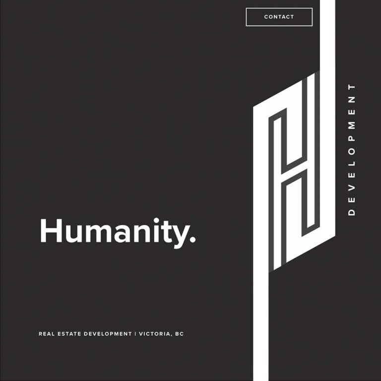
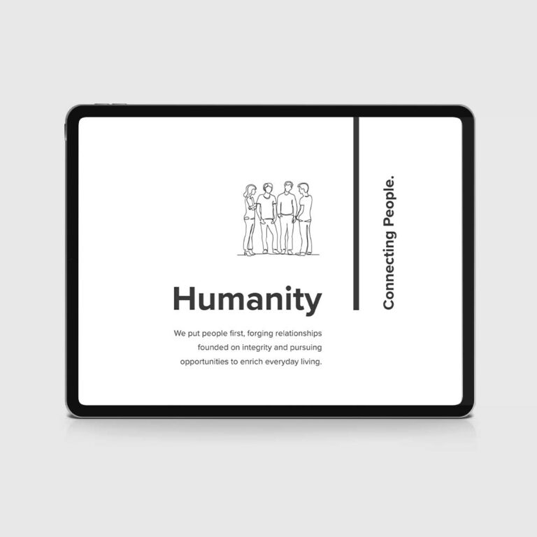
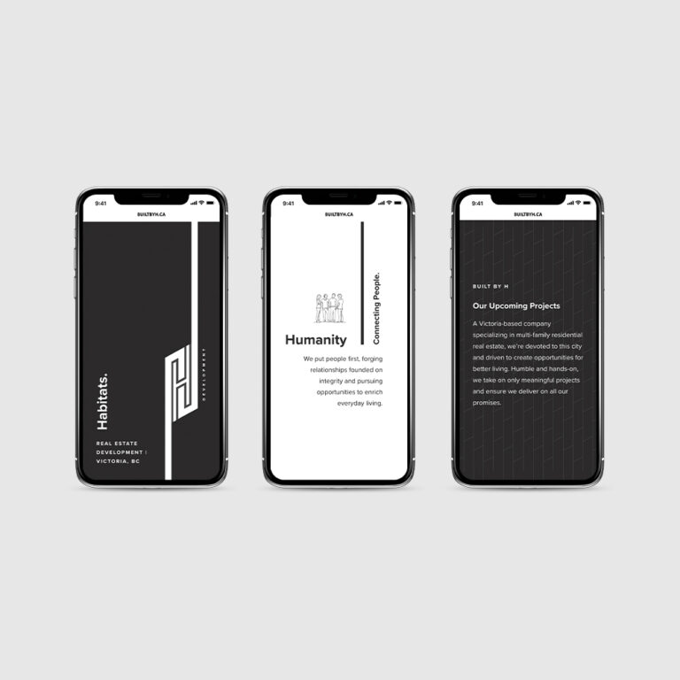
Introducing H Development, which stands for humanity, habitats, and home. In other words, a company that puts people first and elevates relationships; that recognizes that a home requires more than a structure—it needs a vibrant, walkable, livable community; and that homes should be well-built and beautiful, the perfect setting for the important work of living. H Development communicates all this and allows for future storytelling possibilities.
A Bold Visual Identity
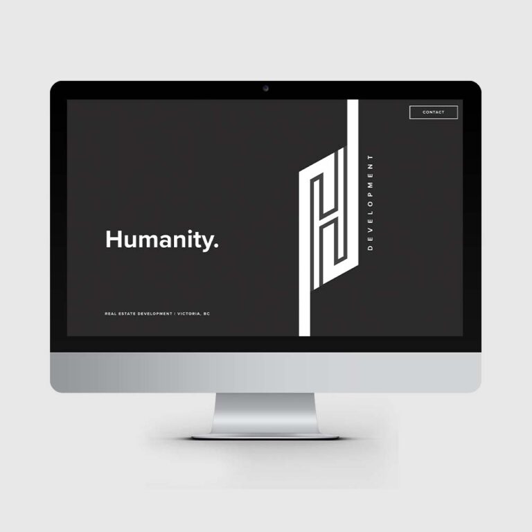
With the company’s name in place, we created a logo that stands tall. Clean and modern, its angular shape gives it personality and creates movement, which we capitalized on in the accompanying website’s design. Bold lines connect the various sections of the page, elegantly guiding the visitor to new content, subtle animations bring dynamism and visual interest, and line drawing illustrations add friendliness and charm. The website’s black and white palette is simple and powerful, helping to emphasize the logo, positioning line, and communication.
H Development may be new to Victoria’s real estate industry, but we’re looking forward to seeing their values-driven approach in action.
Client: H Development
Title: Humanity. Habitats. Home.
Project: WordPress Website / Branding